Text editors
In college, I knew some people with strong opinions about text editors.
Erika: gvim is one of the two true text editors.
Gabe: The other being vim?
Professor O'Neill defines mode error for the User Interface Design class and gives some examples.
Student: So when I'm using vim, and I forget to press 'i' before typing text, that's a mode error?
O'Neill: Yes. Using vim is a mode error.
I use Win32Pad for most editing. It's faster than Notepad, supports most of the keyboard shortcuts I'm used to (Ctrl+Left, Ctrl+Shift+Right, clipboard operations, etc.), and includes a few of the features I think every text editor should have, such as block indent, auto-indent, and clickable URLs. It's missing a few features I'd like, such as preventing me from opening two instances with the same file. It also doesn't support Unicode well, so I have to use Notepad for web pages that contain both Polish and French text.
No prices on SBC.com
Jakob Nielsen, Top Ten Web-Design Mistakes of 2002:
1. No prices. No B2C ecommerce site would make this mistake, but it's rife in B2B, where most "enterprise solutions" are presented so that you can't tell whether they are suited for 100 people or 100,000 people.
I also thought no B2C site would make that mistake, until I tried to purchase an SBC phone line for my apartment. After I clicked "Residential customers", clicked "Local > New Phone Service", and entered my address, the site asked me for billing and credit information. At no time did I see a price or even a link labelled "prices".
I decided not to purchase a phone line.
Character Encoding UI in Firefox
There seem to be five ways to set character encodings in Firefox.
- Options > General > Languages > Default character encoding
- View > Character Coding > Auto-Detect > (select a language or "Off" or "Universal")
- View > Character Coding > More > (select an encoding)
- View > Character Coding > Customize > Active character encodings
- View > Character Coding > (select an encoding)
What do these options do? How do they interact? How can the options and how they interact be made more clear in the UI, or even in Help? Note that I only have a vague idea of what a character encoding is and why a user would need to select one.
Google didn't get me far. Help in Firefox only says "View > Character Coding: Allows you to manually change the character encoding on a Web page. Firefox usually does this automatically." Bug 181541 comments 61 and 62 helped me understand a little.
Race conditions in security dialogs
I discovered arbitrary code execution holes in Firefox, Internet Explorer, and Opera that involve human reaction time. One version of the attack works like this:

The page contains a captcha displaying the word "only" and asks you to type the word to verify that you are a human. As soon as you type 'n', the site attempts to install software, resulting in a security dialog. When you type 'y' at the end of the word, you trigger the 'Yes' button in the dialog. I made a demo of this attack for Firefox and Mozilla.
Another form of the attack involves convincing the user to double-click a certain spot on the screen. This spot happens to be the location where the 'Yes' button will appear. The first click triggers the dialog; the second click lands on the 'Yes' button. I made a demo of this attack for Firefox and Mozilla.
These types of attack work on any security dialog that can be triggered by untrusted content. The attack is most useful in a dialog where one of the buttons means "Yes, let this untrusted content run arbitrary code". Firefox has such a dialog in the form of the extension installation (XPI) dialog. Similarly, Internet Explorer has the ActiveX installation dialog and Opera has an "Open" button for downloaded executables. Programs other than browsers might also be vulnerable.
Firefox's solution, from bug 162020, is to delay enabling the "Yes"/"Install" buttons until three seconds after the dialog appears. I believe that this is the only possible fix other than completely denying untrusted content the ability to pose the dialog. Unfortunately, this fix is frustrating for users who install extensions often.
Some users have been intentionally lowering the delay to 0 seconds, which frustrates me. These users think the delay was added merely to force everyone to read the dialog. I surprises me that these users were not able to figure out the security hole given the fix. Ironically, advanced users are the most susceptible to these attacks, because they type and double-click faster than they react to unexpected stimuli.
It might be possible to lower the delay to less than three seconds, making it less annoying, without jeopardizing security. Designing experiments to determine the minimum "safe" delay would be tricky. You would want to do everything an attacker could do to increase participants' reaction time: give them a complicated task, make new rectangles appear every second to make the dialog less unexpected, etc.
It might make sense to make the dialog appear only after the user clicks a statusbar indicator that means "This web site wants to install software". This would get rid of the problem of choosing a delay, and it wouldn't require users who want to install extensions to wait.
Blogs about bad design and bad software
We Hates Software (blog-like archive for a mailing list)
- Having to make clean
- Useless car websites
- File pickers
- Browser detection: broken, let me bypass it
- Browsers: 1, 2, 3, 4, 5, 6, 7, 8, 9, 10, 11, 12, 13, 14, 15
3-hour UI review of Expedia
I signed up to interview with Expedia on Monday. I figured I should look at their site for a few minutes before interviewing with them, but I ended up playing with their basic search feature for over an hour.
Should I spend my 30-minute interview pointing out how their site sucks* or trying to get a job?
The form on the front page
- "Search for flight" (for submitting the form) looks like a link, not a button. IE users are used to losing form data randomly when they click on links, so they'll spend a lot of time looking for something that looks like a button before clicking the link.
- The return date textbox is prefilled with "mm/dd/yy". Prefilling textboxes like that is usually frowned upon, in part because it makes people like me skip the textbox. But I think I understand why Expedia prefills it.
- If the return date textbox is prefilled, it should clear itself onmousedown!
- Why make it look like I have to enter a year? I'm very unlikely to book a flight more than a year in advance. And I'm still typing the year as "03" out of habit, even though it's been 2004 for a month.
- The single-digit date for February in the "Depart" textbox makes it look less like a date.
- Why can't I get a flight and a car without a hotel? I can get every other combination of flight, car, and hotel.
- I think the form should use 3 checkboxes (flight, car, hotel) rather than 7 radio buttons (each nonempty subset of {flight, car, hotel}). Using checkboxes would make the UI simpler but would require more clicking.
- "Morning, Noon, Evening, Anytime": What times does Expedia consider "morning"? More importantly, what times are "noon"?
- "Morning, Noon, Evening, Anytime": Where's the "middle of the night" option?
- The DHTML calendar does not work in Firebird.
- In the DHTML calendar, double-clicking the right button only goes forward one month. This is a bug in IE, but Expedia should work around it because it affects almost everyone who books a flight two or more months in advance.
Simple JS learning environment
Leonard Lin is teaching animation students basic programming so they'll be able to use Maya's MELScript and Flash's ActionScript. He chose JavaScript as the first language for his students because JavaScript and ActionScript are both variants of ECMAScript.
I made a simple JS learning environment to cut out the save-switch-reload cycle and the "magic" HTML that surrounds a short JS program. If an error occurs, it highlights the line.
I reused a lot of code and UI ideas to make it. The overall UI comes from the Real-time HTML editor, the print() function comes from the JavaScript Shell, and the error-selecting idea and code come from the "blogidate XML well-formedness" bookmarklet. If you want to look at the code for the JS env, most of it is in the "buttons" frame.
What should be fixed in Firebird 0.8
Update Jan 30: see also What's new in Firebird 0.8.
alanjstr listed 11 bugs he thinks should be fixed before Firebird 0.8 is released. I agree with him on 3 bugs:
- 229600 - Installing 2 extensions without restarting re-launches extension-installer for previous installed extensions. (regression)
- 228988 - XPInstall - "Installation complete / restart" message always shown. (regression)
- 230271 - Form autocomplete only works in the first tab. (regression)
I have 2 more bugs that I think should be fixed before 0.8:
- 217410 - bump skin version. (This would prevent "no scrollbars after upgrade" problem.)
- 228672 - Installer deletes unrelated folders. (Dataloss. New because Firebird 0.7 didn't have an installer.)
The installer bug is particularly scary because of the potential PR impact. The Firebird installer deletes all files in the installation directory if you check the "Safe Upgrade" box. A few users who installed nightlies into "C:\Program Files\" lost that entire directory. I don't know if any users have lost data since the Dec 23 change to make the "Safe Upgrade" box unchecked by default, but if Firebird 0.8 is released with the bug, I'd expect at least a few users who install to weird directories to check the box.
A bug in the iTunes installer that wiped hard disks earned a Slashdot story. If Firebird 0.8 is released with this bug, I would expect it to lead to an even bigger backlash on Slashdot because:
- The iTunes installer tried to delete iTunes.app (a specific application folder), while the Firebird installer tries to delete whatever directory you were installing to. "Nuke from orbit" upgrades are inherently dangerous, but they're even more dangerous when the user gets to choose the target directory.
- The iTunes installer deleted more than it intended because of what is arguably a misfeature of the Bash shell: if you don't use quotes carefully, a script's behavior can change unexpectedly when a parameter contains a space. The Firebird installer deletes more than it intends because its developers didn't anticipate users installing Firebird directly to "C:\Program Files\". Firebird has nobody else to share the blame.
- Firebird's development process is open enough that anyone can see that we knew about the problem since at least December 30.
- "Safe Upgrade" is the worst possible name for a misbehaving nuke-from-orbit feature.
My preferred solution for 0.8 is to relabel the checkbox from "Safe Upgrade" to "Delete all files in [installation directory]". (cf bug 197274, which changed "Enable Automatic Image Resizing" to "Resize large images to fit in the browser window".) I looked at some code but couldn't tell how hard it would be to change the checkbox label to include the installation directory.
I'm not sure what the installer "should" do. It would be nice if installing on top of an old build didn't cause random-seeming problems. Then nuking the installation directory from orbit would not be necessary. If fixing those problems is not feasible, maybe the installer should have a list of files or subfolders to delete, and only delete those.
Flag queries: blocking0.8+ (blocking), blocking0.8? (nominated), blocking0.8- (not blocking). Anyone may nominate bugs, but only a few people may plus or minus. Bugs that are plussed are usually recent regressions or newly discovered security holes. Don't renominate a minused bug unless you're sure you've added something the minuser didn't know.
Wrong date on midnight tickets
AMC printed the wrong date on Lord of the Rings tickets again:
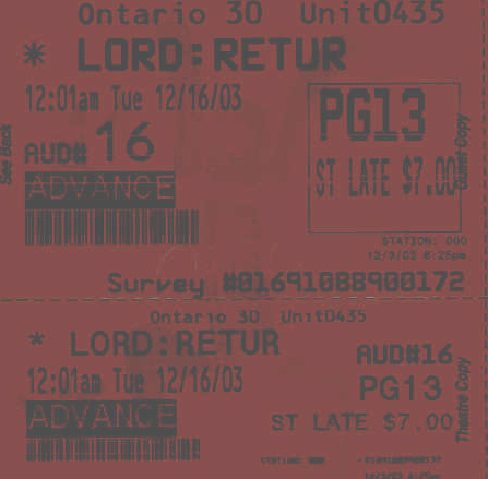
Two years ago, my suitemate and a few of her friends drove to the theater on Monday night for Fellowship. As she left, she told me she had tickets to see the movie a day early. I believed her until I saw her at the theater on Tuesday night.
I'm not aware of any Mudders making the same mistake this year.
I wonder if printing the wrong date could be intentional. It's better if 10 people drive a day early than if 2 people drive a day late. Someone at the theater said the tickets are printed incorrectly because the AMC software only understands business days.
False fire alarm
South has about one false fire alarm a year, usually due to kitchen non-fires. When there was a fire alarm at 6:50am last Friday, many students stayed in their rooms the whole time. I do not think this is a coincidence.
I took time to get fully dressed, and even then I was one of the first students in the parking lot. Only a third of the students in the dorm came to the parking lot during the 10-minute alarm. Some students came out of their rooms briefly, saw Michaela waving her burnt toast around, and went back into their rooms. The rest either slept through the alarm (unlikely, given how loud it is) or decided to stay in bed.
In California, it is illegal to "impair the effective operation of a [fire-protection system], so as to threaten the safety of any occupant or user of the structure in the event of a fire". So it's clear that we can't reduce the sensitivity of alarms in the dorm just because we find false alarms annoying. But what if we think a reduction in the false alarm rate would make residents take fire alarms more seriously? Could we argue that making the detector near the kitchen less sensitive would make the alarm system "less impaired"?
Cornell University has taken steps to reduce false alarm rates in dorms. They were able to do so with the encouragement of the Ithaca Fire Department and presumably without breaking any New York laws. This is encouraging, even though I live in California.
Yahoo! Maps becomes printerless-friendly
In the middle of August, Yahoo! Maps made several changes to the way it displays directions:
- The first step, "Start on [street]", became "Start at [address], [city]".
- A last step was added: "Arrive at [address], [city]".
- "Left" and "Right" were replaced by black circles containing "L" and "R", and the column on the right side of the table with arrows was removed.
- Distances and turns used to be separate columns, but now the main column contains lines like "Turn R on MIRALESTE DR - go 0.8 miles".
All of these changes slightly improve the printed directions. But one change can vastly improve directions copied by hand: adding the destination address as the last step.
When I had a small party at my house early in August (before the changes), everyone used Yahoo! Maps for directions because I included a Get directions to my house URL in the invitation. One friend called just before arriving to ask what my address was. Another friend asked a neighbor which house was mine. They both forgot to copy down the address, which appeared in the invitation e-mail and at the top of the Yahoo! Maps page but not in directions themselves.
Yahoo! Maps joins Mappoint in including the destination address as the last step in the directions. Mapquest and Expedia Maps still do not. Expedia's last step is "End: Arrive End".
Sign anywhere
Financial Registration cards don't have a spot for a signature. Most students behind the tables say "Sign your name anywhere". This semester, Michael Vrable was behind one of the tables, and he said "Sign your name at the bottom" or "Sign your name anywhere at the bottom" instead. Michael's instructions would have saved me a second of looking for the best place to sign (important when there's a line) but wouldn't have been as much fun. There wasn't a line when I was there.
Suggestions for Google Calculator
General suggestions
- Stay within unit systems. If I search for rod= or acre, give the answer in feet or square feet, not meters or square meters. If I search for 1 acre / 1 mile, say 8.25 feet instead of 2.5146 meters.
- Output in km/h rather than m/s if the inputs are in terms of kilometers and hours or days. 800 km / 8 hours should be 100 km/h (rather than 27.77777778 m/s), but 3/5 c and 10 m / 3 s should be in m/s.
- Parse 8 h as "8 hours", not "8 times Planck's constant". Not everyone knows what Planck's constant is or that it is represented by "h". I noticed this problem while searching for 800 km / 8 h. Strangely, 800 km / 100 km/h works as I would expect.
- Never round aggressively. Round without explanation once (one baker's dozen in dozens), and you lose my trust whenever you output an integer (1 acre in square feet) unless I figure out your rule for when to round.
Error-handling
- Floating-point arithmetic errors (1 / 0, 2 ^ 2000) should be displayed by default. Currently, they cause the calculator line to not appear, as if the calculator hadn't feature been triggered at all.
- Unit errors should be displayed by default. Examples: 1 acre in feet, 1 meter + 2 seconds, cube root of a square mile.
- There should be a way to see syntax errors so I'm not left in the dark when I make an error in my input and only get search results. It would make sense to use = at the end of a search for this, since = already causes questionable calculations like 1 feet= or 8 mile= and useless calculations like 6 cm= to be displayed.
New features
- Add support for multiple-unit output: 100 minutes in hours and minutes.
Five things not to do at the command line
rm blah *- This user meant to type "rm blah*", but accidentally hit space between 'h' and '*'. As a result, rm deleted blah, then deleted everything.
tar czf *.cpp *.h- The first filename after 'f' is tar's output file. "Well, all but the first one got backed up at least..."
grep --context=100 "foo" * > found.txt- This user was trying to search a directory of IRC logs for some text. Since the output file (found.txt) was in the same directory, grep kept finding new matches in found.txt and adding them to the end of found.txt. Found.txt was 900MB by the time he noticed the error.
rm -rf $2Applications/iTunes.app 2- The lack of quotes around "$2Applications/iTunes.app" caused this line in the iTunes installer to only work as intended when $2 contained no spaces. If $2 was "Disk 1", a disk called "Disk" could be deleted.
cd $DESTDIR

rm -rf *

gunzip -c $FILE | tar x- This user had not mounted the memory stick $DESTDIR was on before running the script. The cd failed to move to $DESTDIR, but the script continued, deleting everything in the directory the script was running in.
Three of these examples come from a thread on the East Dorm chat list.